今回はローディング中やダウンロードの進行を表現するProgressViewの使い方について説明します。
環境
- Xcode12.5.1
- 動作はシミュレーターのiPhone12 miniで確認
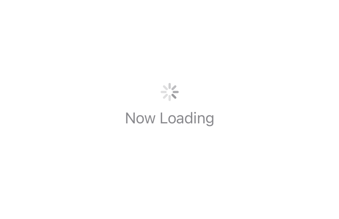
CircularProgressViewStyle
CircularProgressViewStyleは、通信中などに使うクルクルと回転するものです。引数に文字列を渡すことでラベルを表示できます。
struct ContentView: View {
    var body: some View {
        ProgressView("Now Loading")
    }
}
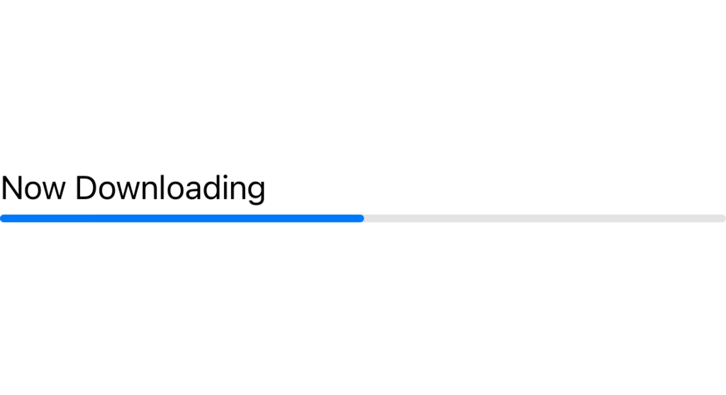
LinearProgressViewStyle
LinearProgressViewStyleはダウンロードの進行状態を表す際などに使用する棒状のスタイルです。value: には進行具合を渡す変数を、total: は value に対しての最大値を指定します。
(今回はデザインがわかりやすいように、初期値を50.0にしています)
struct ContentView: View {
    @State private var current = 50.0
    var body: some View {
        ProgressView("Now Downloading", value: current, total: 100)
    }
}
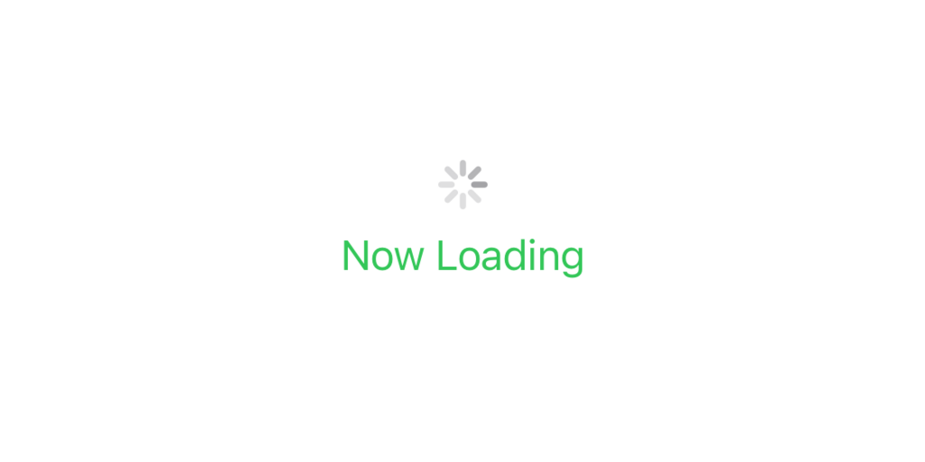
色の変更
CircularProgressViewStyleはテキストのみ色を変更できます。
struct ContentView: View {
    var body: some View {
        ProgressView("Now Loading")
            .foregroundColor(.green)
    }
}
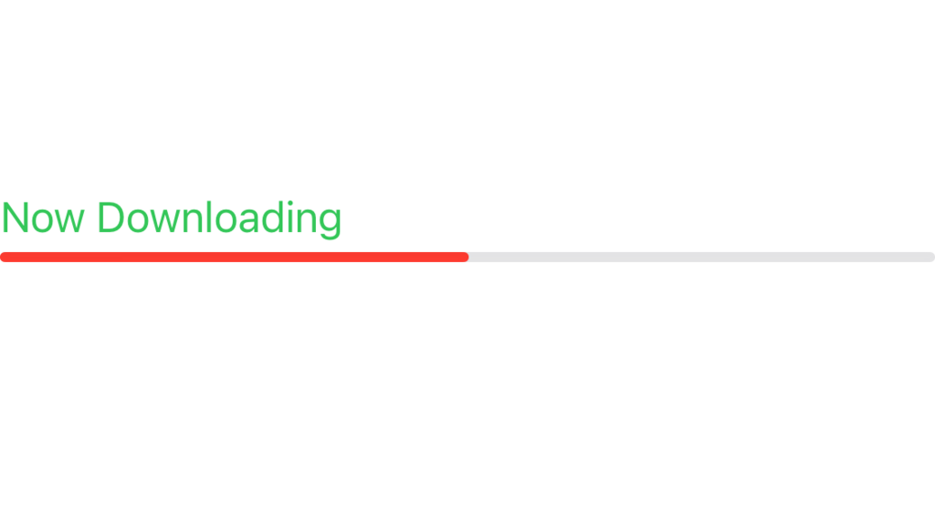
LinearProgressViewStyleはテキストとバーの色を変更できます。
struct ContentView: View {
    @State private var current = 50.0
    var body: some View {
        ProgressView("Now Downloading", value: current, total: 100)
            .accentColor(.red)
            .foregroundColor(.green)
    }
}
今回は以上です。


コメント